
13 Terrace Wall Painting Ideas Makeovers That Look Incredibly Expensive
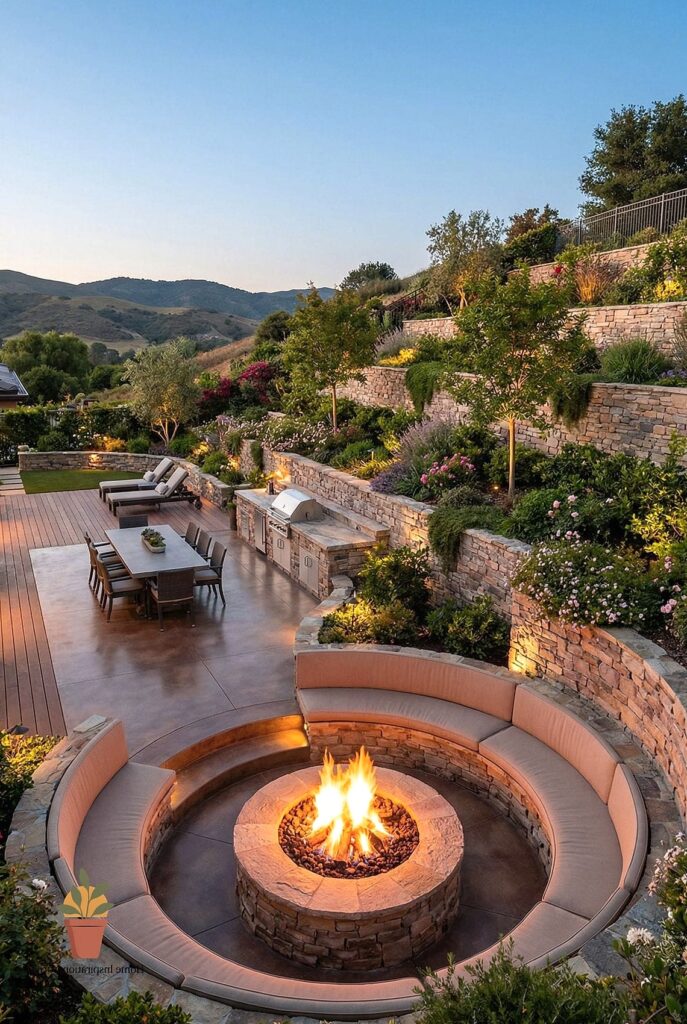
- Warm Terracotta for a Mediterranean Feel
- Deep Charcoal for a Moody, Modern Look
- Soft Sage Green for a Calming Retreat
- Textured Limewash for an Old-World Look
- Crisp White with Black Trim Accents
- Dusty Blue for a Coastal Feel
- Rich Terracotta and Cream Two-Tone Walls
- Matte Black for Bold Drama
- Soft Blush Pink for Unexpected Warmth
- Natural Stone-Look Paint Finish
- Olive Green for an Earthy, Grounded Look
- Layered Neutral Tones with Textured Panels
- Deep Forest Green for a Lush, Enclosed Feel
13 Terrace Wall Painting Ideas Makeovers That Look Incredibly Expensive
A terrace is one of those spaces that gets ignored until you actually sit out there and realize the walls look tired, patchy, or just plain boring. The good news is that paint is one of the cheapest ways to make an outdoor space feel like a completely different property. You don’t need a contractor or a huge budget to pull this off. You just need the right color, the right finish, and a little patience. Here are 13 terrace wall painting ideas that genuinely look like you spent way more than you did.
Warm Terracotta for a Mediterranean Feel
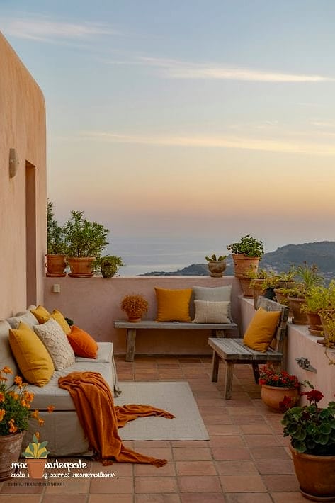
Terracotta walls instantly bring in that sun-soaked, European courtyard vibe without you having to book a flight. This color works especially well on terraces that get a lot of natural light throughout the day, since it warms up even further in the afternoon glow. Homeowners love it because it pairs beautifully with greenery, wicker furniture, and terracotta pots, which basically decorate themselves once the wall color is set. It’s forgiving with dust and outdoor grime too, since the tone hides minor marks better than a stark white would. If you want a budget version, a matte exterior paint in a warm clay shade does the trick. For something more elevated, a lime-wash finish adds texture that catches light differently throughout the day.
Deep Charcoal for a Moody, Modern Look
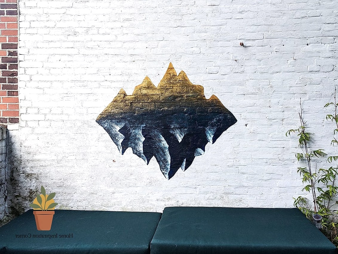
Charcoal walls on a terrace feel unexpected in the best way, especially against string lights or brass lanterns at night. This works best on covered terraces where the paint isn’t taking a direct beating from rain, since darker exterior paints can show water spotting more easily. Designers gravitate toward this shade because it makes furniture and plants pop instead of blending into the background. Pair it with warm wood accents and layered lighting for a look that feels more like a boutique hotel lounge than a backyard. It does show dust a bit more than lighter shades, so a quick wipe-down every couple weeks keeps it looking sharp.
Soft Sage Green for a Calming Retreat
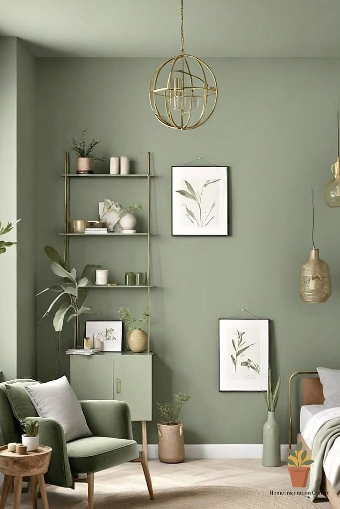
Sage has been having a moment indoors for years now, and it translates just as well outside. It reads as fresh without being too saturated, which makes it a safe pick if you’re nervous about committing to a bold terrace color. This shade works particularly well on terraces surrounded by plants, since it echoes the greenery rather than competing with it. It’s also genuinely relaxing to look at, which matters if your terrace is where you unwind after work. Renters can lean into this trend with peel-and-stick wallpaper panels instead of paint if a full repaint isn’t allowed.
Textured Limewash for an Old-World Look
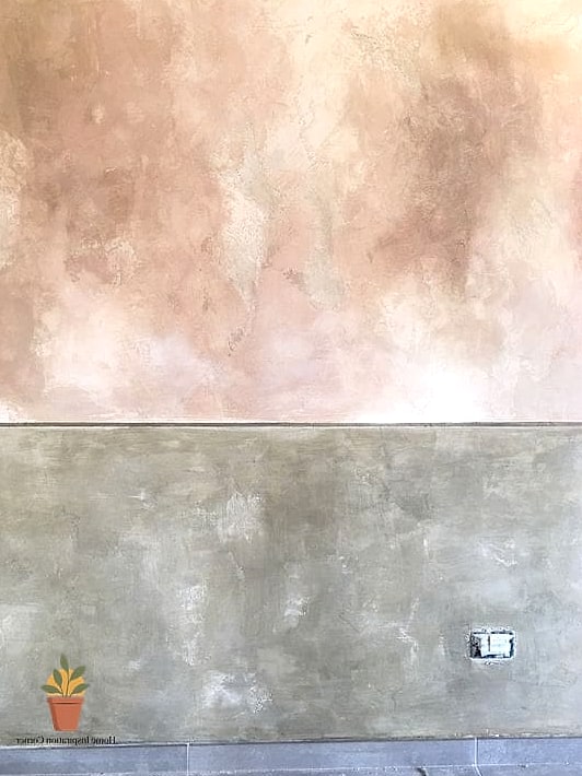
Limewash paint has this soft, cloudy, almost weathered quality that regular flat paint just can’t fake. It’s become a favorite among DIY bloggers because it photographs beautifully and gives walls a sense of age and character, even on a brand-new build. This finish works best on stucco, brick, or textured concrete terraces where the paint can settle into the surface naturally. It does require a bit more patience during application since it’s meant to look imperfect, but that’s exactly the point. Maintenance is fairly low, though touch-ups blend in more easily than with standard paint, which is a nice bonus.
Crisp White with Black Trim Accents
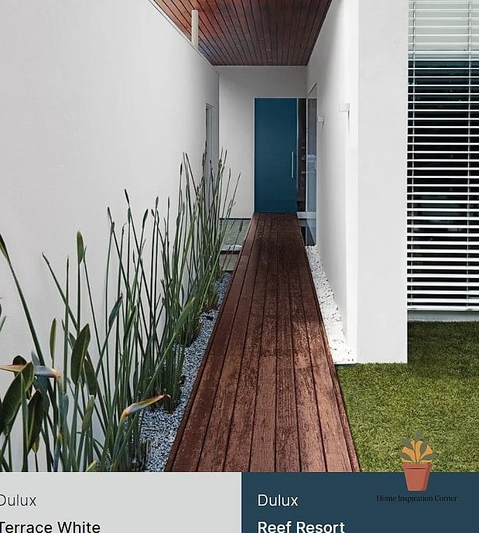
There’s a reason this combo shows up in so many high-end renovation photos. White walls paired with black window frames, railings, or door trim create a graphic contrast that reads as intentional and polished. This works especially well on smaller terraces since white keeps the space feeling open and bright rather than boxed in. It’s practical too, reflecting heat during summer months and making the space feel cooler underfoot. The trick is committing fully to the trim color so it doesn’t look accidental. A satin or eggshell finish on the white keeps it from feeling too clinical.
Dusty Blue for a Coastal Feel
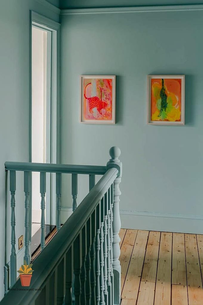
Dusty blue sits in that sweet spot between calming and interesting, which is probably why it keeps showing up in coastal-inspired terrace makeovers. It looks especially good with white or natural wood furniture and rope or rattan accents. This color tends to shift depending on the light, looking almost gray in shade and more vivid blue in direct sun, which gives the space some visual movement throughout the day. It’s a great option for terraces near a pool or water feature since it echoes that environment naturally. Maintenance-wise, it holds up well against fading if you go with a UV-resistant exterior paint.
Rich Terracotta and Cream Two-Tone Walls
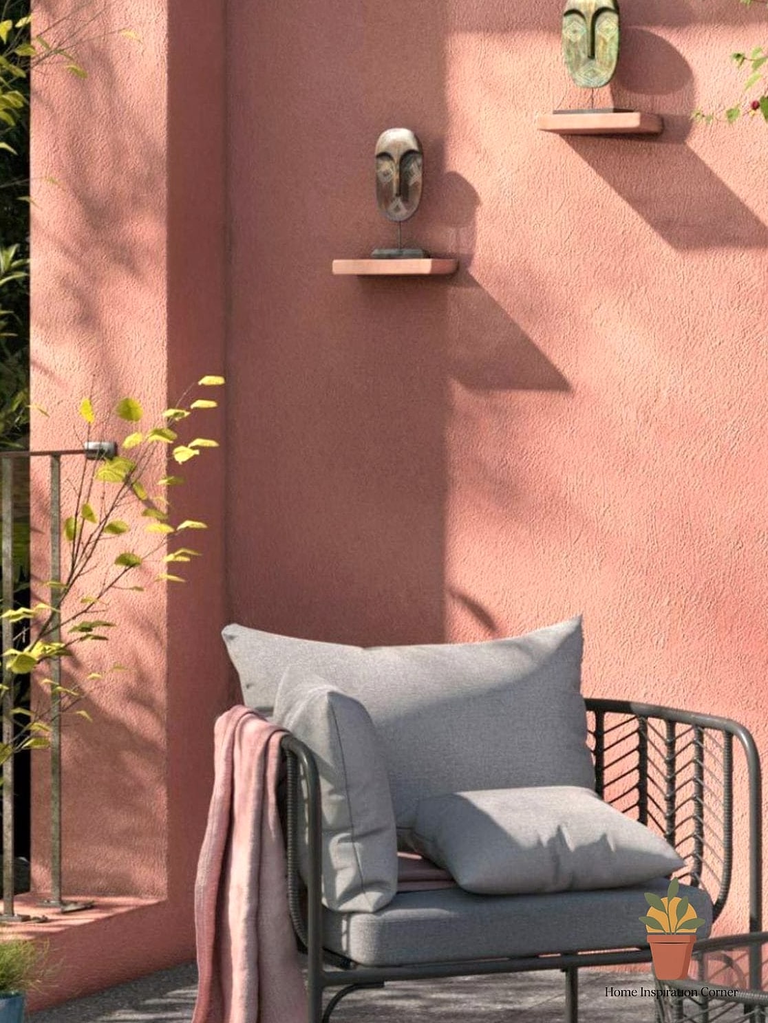
Splitting your terrace wall into two tones, usually with a lower band of terracotta and cream above, creates a custom, almost architectural look without any extra construction. This technique works particularly well on taller terrace walls where a single flat color can feel a little flat and uninteresting. It’s a favorite among DIY decorators because painter’s tape and a level are really all you need to get sharp lines. The lower band also tends to hide scuffs from furniture or foot traffic better than a single light color would across the whole wall. You can adjust the ratio depending on your space, going higher with the darker tone for drama or lower for a subtler effect.
Matte Black for Bold Drama
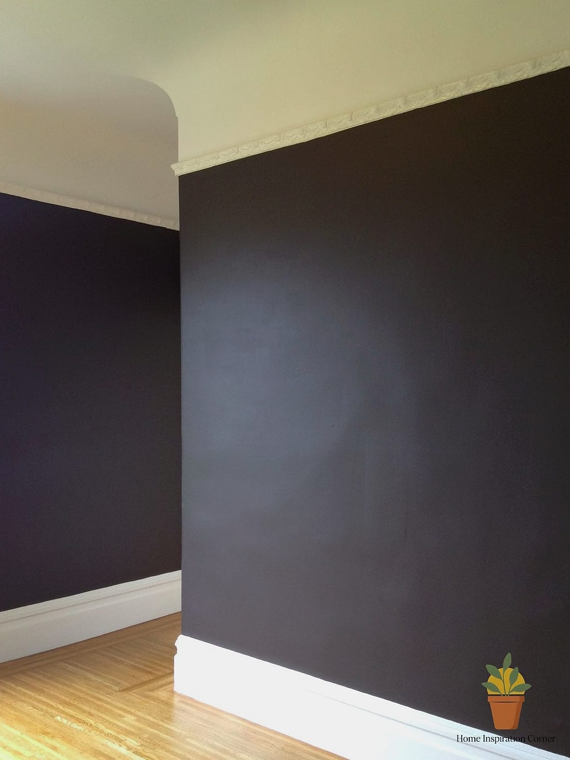
Matte black terrace walls sound intense on paper, but in person they create this incredible backdrop that makes everything else in the space look intentional and curated. This works best on larger terraces with good natural light, since black can feel heavy in smaller, darker spots. It pairs beautifully with greenery, since plants practically glow against a dark backdrop, and with warm brass or wood accents for contrast. It’s a striking choice for anyone who wants their terrace to feel more like an extension of a moody, design-forward living room. The main consideration is heat absorption in direct sun, so it’s worth checking how much sun exposure your terrace actually gets before committing.
Soft Blush Pink for Unexpected Warmth
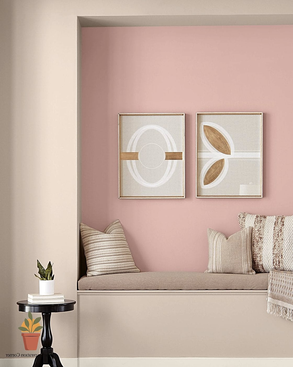
Blush walls on a terrace read as surprisingly sophisticated rather than overly sweet, especially in a muted, dusty shade rather than anything too bright. This color works well on terraces that don’t get harsh direct sunlight all day, since softer pinks can look washed out under intense glare. It’s a popular pick for anyone wanting their outdoor space to feel a little more personal and less generic than the usual neutral palette. Pairing it with black or dark bronze furniture keeps it from feeling too soft overall. It also photographs incredibly well, which matters if your terrace doubles as a spot for entertaining guests.
Natural Stone-Look Paint Finish
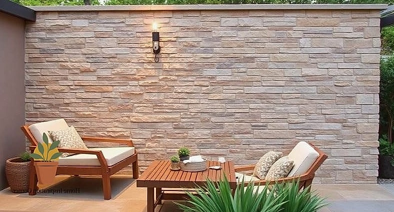
Faux stone paint finishes have gotten remarkably realistic, and they’re a clever way to fake an expensive stone accent wall without the weight, cost, or labor of actual stone. This technique works particularly well as a focal wall rather than covering an entire terrace, since it’s meant to draw the eye to one area. It’s popular with DIYers because specialty paint kits now come with clear instructions and layering techniques that don’t require professional experience. The texture also does a great job of hiding minor imperfections in an older wall surface. For upkeep, a occasional rinse with a garden hose keeps the textured surface looking fresh.
Olive Green for an Earthy, Grounded Look
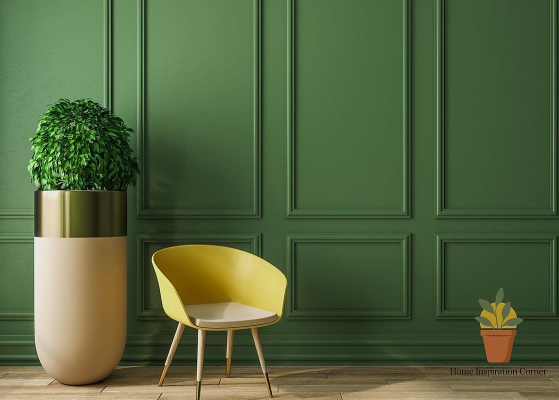
Olive has quietly become one of the most requested exterior colors, and it makes total sense once you see it against natural wood and stone. It feels grounded and mature in a way that trendier greens sometimes don’t, which means it’s less likely to feel dated in a few years. This shade works especially well on terraces with a lot of wood or rattan furniture, since it pulls warm undertones out of both materials. It also tends to hide everyday grime, like dust or light watermarks, better than lighter paint colors would. Pairing it with cream or white trim keeps the whole look from feeling too dark or heavy.
Layered Neutral Tones with Textured Panels
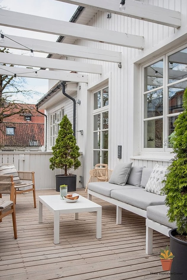
Instead of one flat color, some of the most expensive-looking terraces use layered neutrals, think a base coat of warm beige with textured plaster panels or wood slat accents mixed in. This approach works best if you’re willing to put in a weekend of extra effort, since it involves more than just rolling on paint. It’s a favorite technique among home improvement bloggers because it adds real dimension and makes a small terrace feel more architecturally interesting. Budget-friendly versions can use peel-and-stick wood panels over painted sections instead of actual plaster work. The combination of texture and tone is what really sells the high-end look here.
Deep Forest Green for a Lush, Enclosed Feel
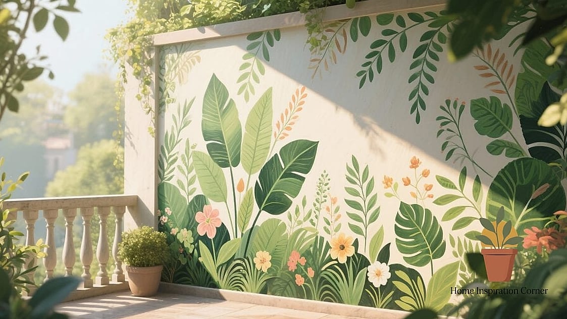
Forest green walls make a terrace feel like it’s wrapping around you, which is especially nice if your outdoor space is surrounded by trees, vines, or tall plants already. This color works best on terraces that already lean toward a garden-like feel, since it blends with the surroundings rather than standing apart from them. It’s a bold choice, but it reads as sophisticated rather than overwhelming when paired with plenty of natural light and simple, uncluttered furniture. Homeowners with pets or kids tend to appreciate that darker greens hide scuffs and dirt far better than pale colors do. A satin finish here adds just enough sheen to keep the space from feeling too cave-like at night.
Any one of these terrace wall painting ideas can genuinely change how your outdoor space feels, and you don’t need to tackle all 13 to see a difference. Pick the one that matches your light, your furniture, and honestly, your patience level for a weekend project. A single wall of color, texture, or contrast is often all it takes to make a terrace look like it belongs in a design magazine rather than an afterthought.